Short Courts
I had the pleasure to rebrand Short Courts. What is a Short Court? Imagine a hand made small scale basketball court for ants.
Goal: Create a legible, flexible, and familiar visual identity.
Before and After
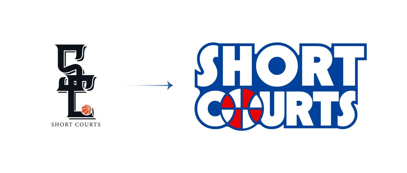
Coming back to the goal of legibility, the original Short Courts logo was mostly illegible and did not adapt well when combined with other basketball logos (major need). In terms of ease of use, the logo needed to be easy to apply on the back of the product.
Inspiration & Process

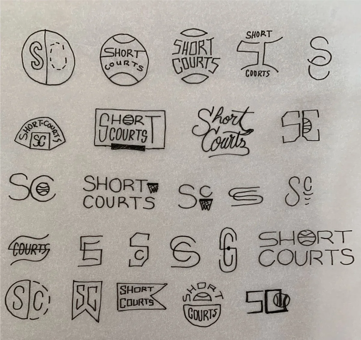
Rounds of revision
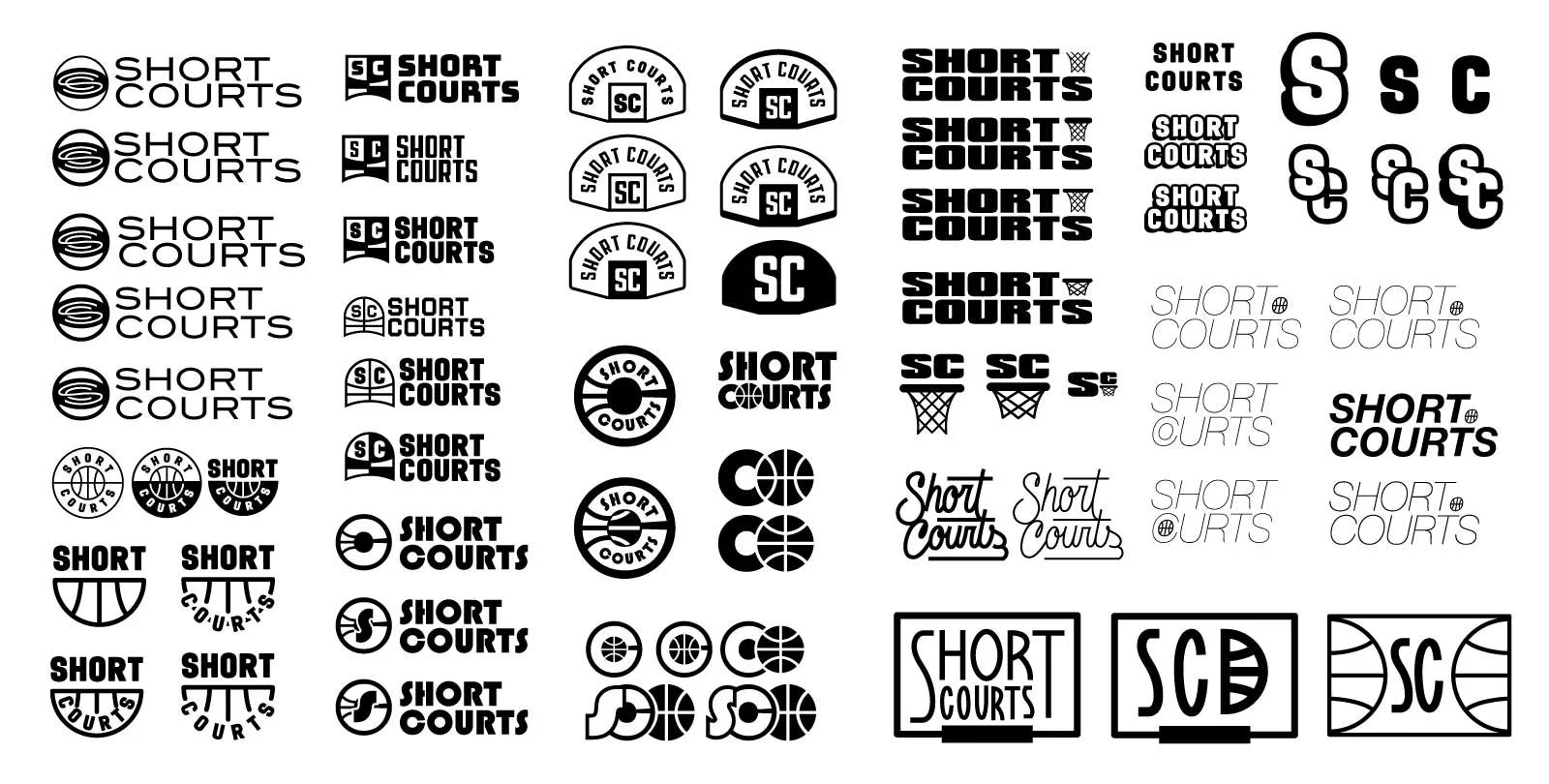
Round 2
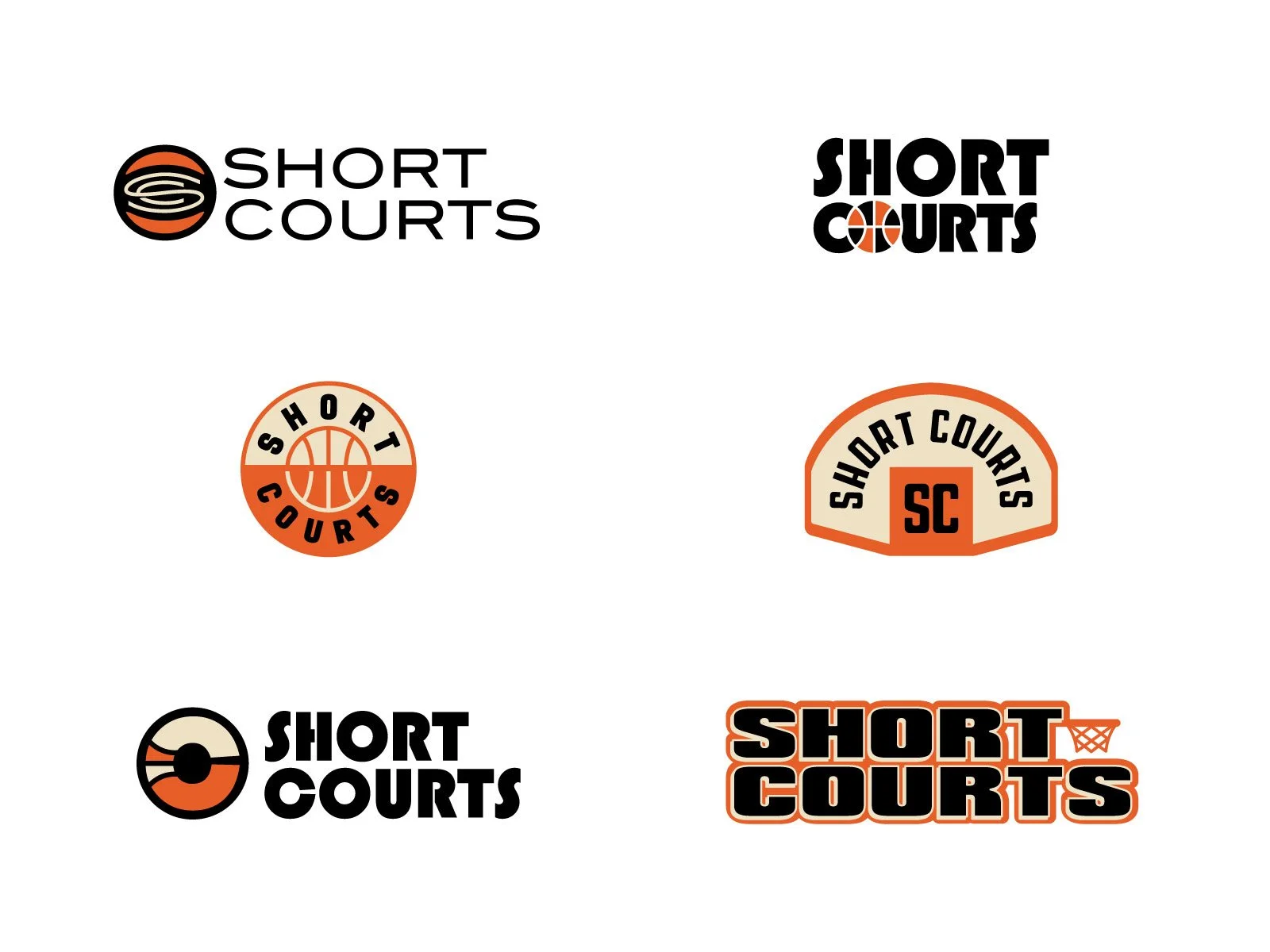
Round 3
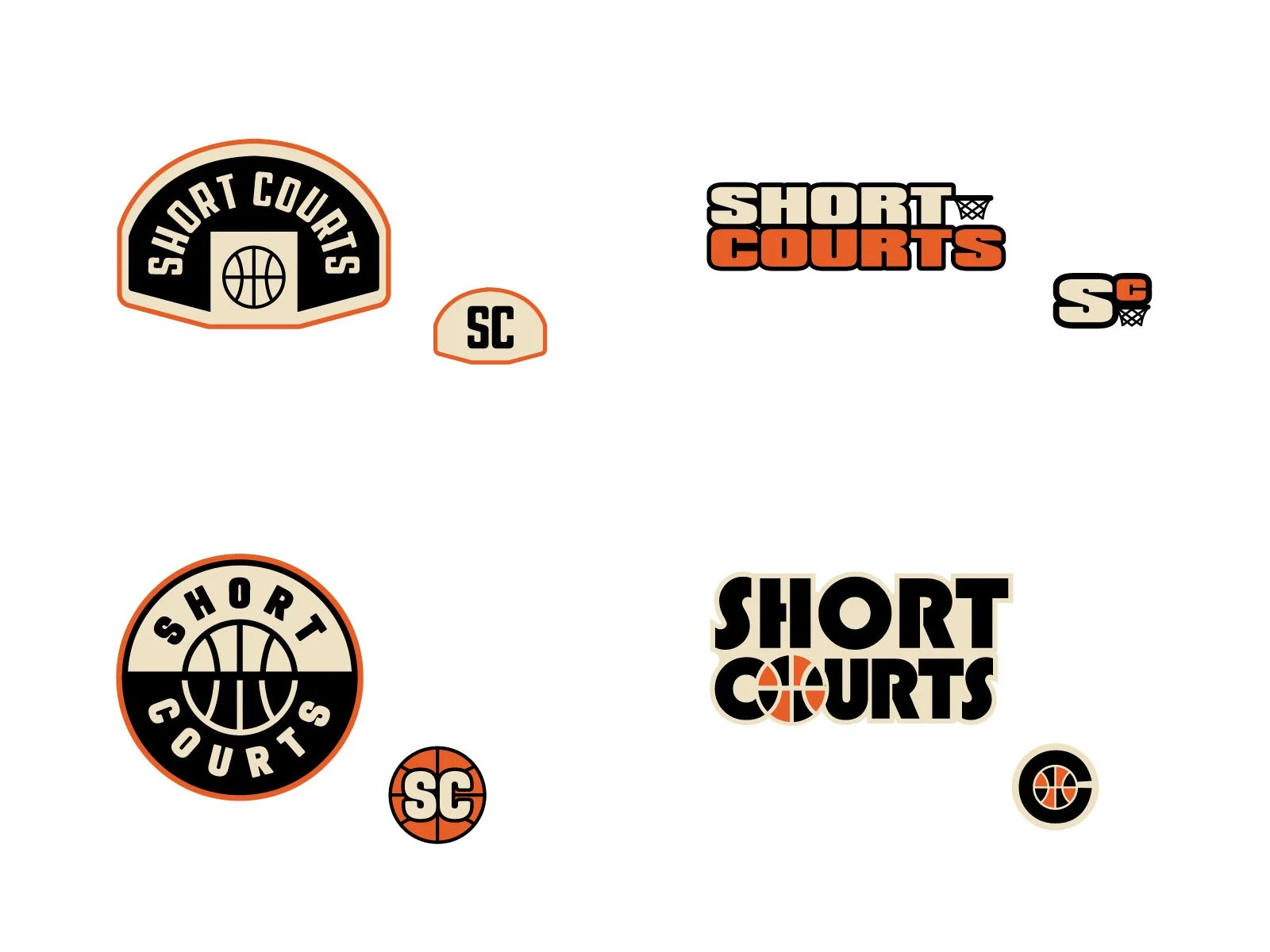
Runner up
It was a hard call choosing the final logo set, but this is the runner up package. As you can see, there is consideration for not only the primary and secondary, but also the ‘combination’ mark where the logo is merged with the team logo.
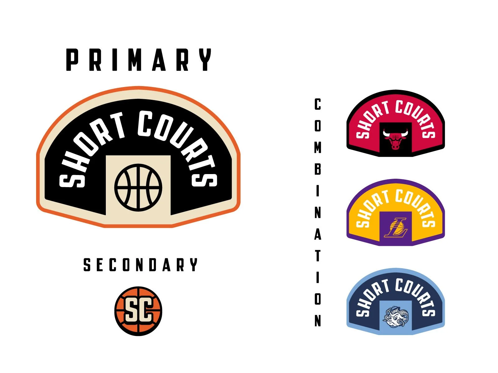
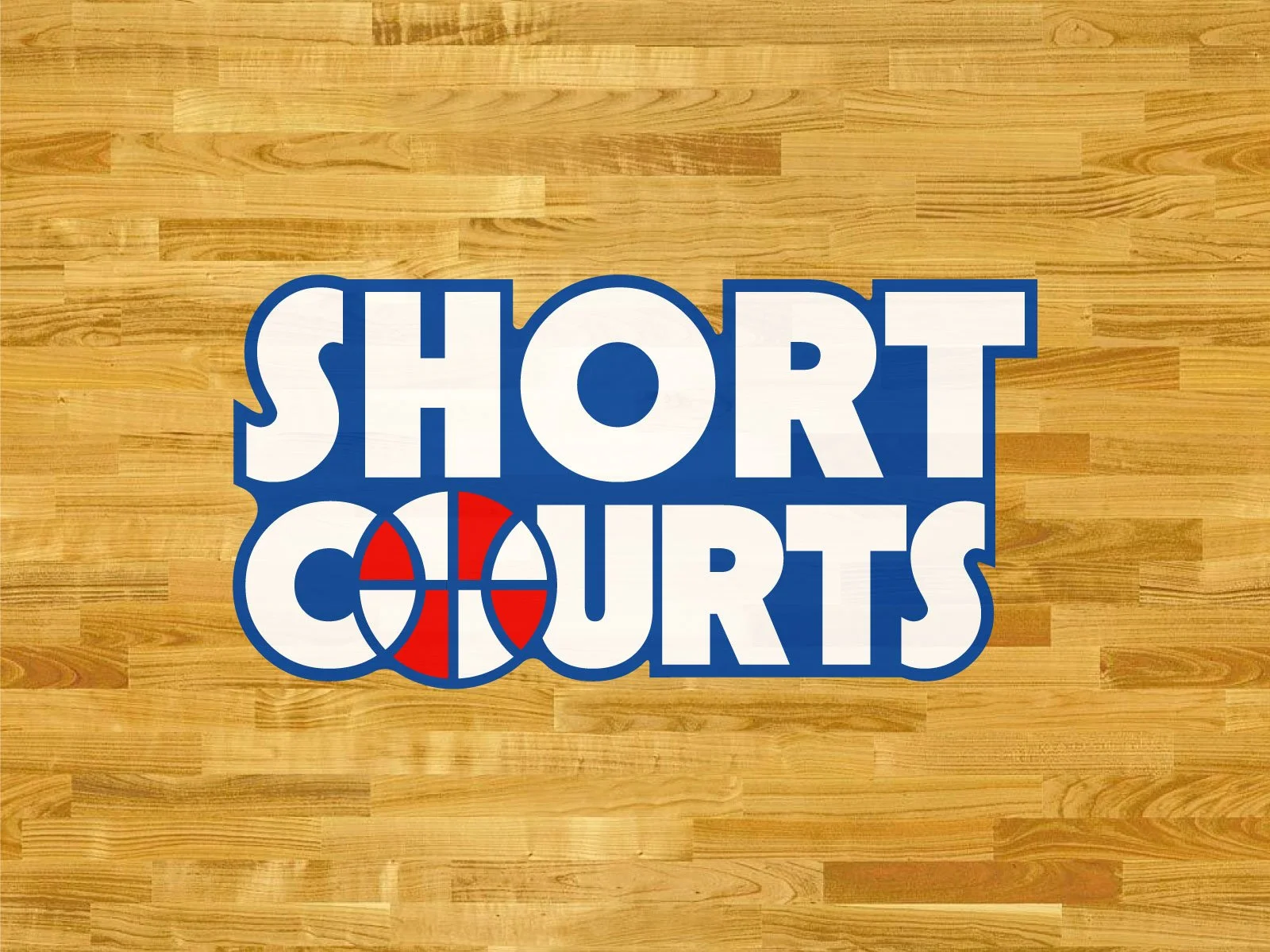
Final color and concept
We went full nostalgic and retro for the final identity. The color is a classic blue, white, and red. For the typography is is based on geometric and familiar shapes.
And now.
The identity you’ve been scrolling for.
Primary & Secondary logos
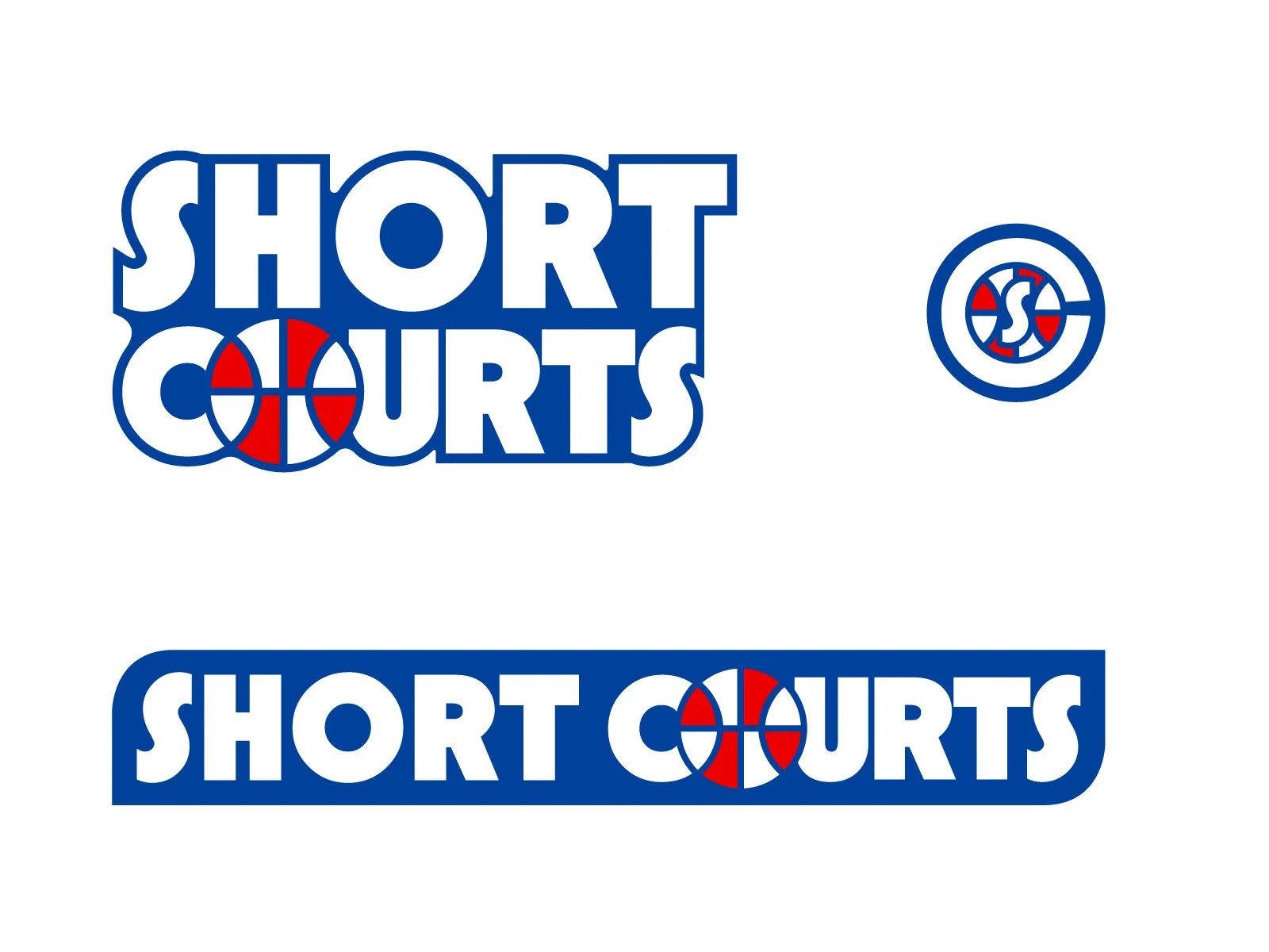
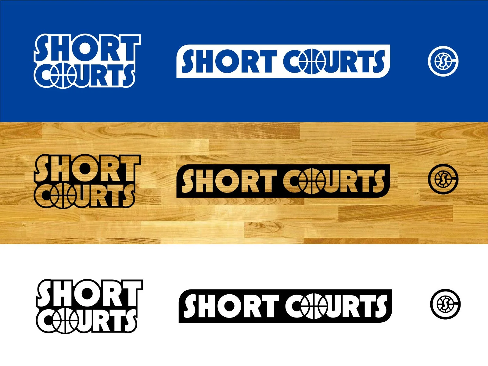
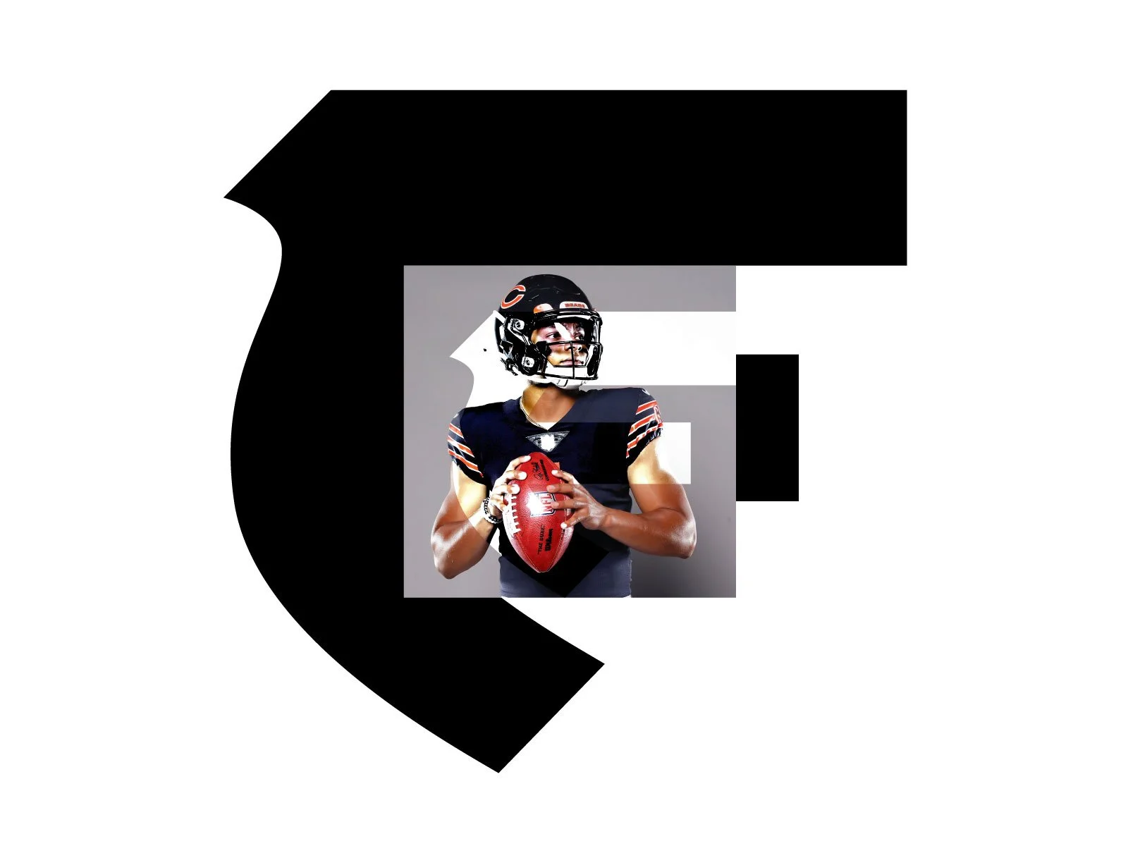
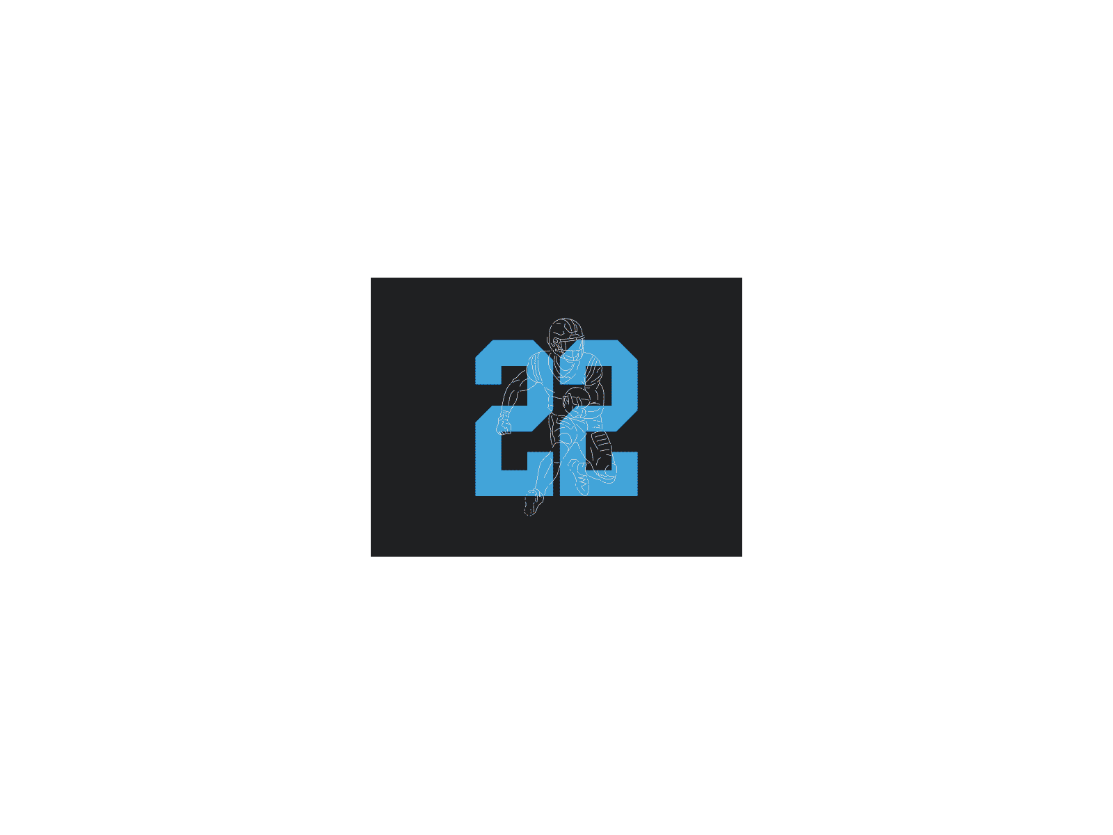
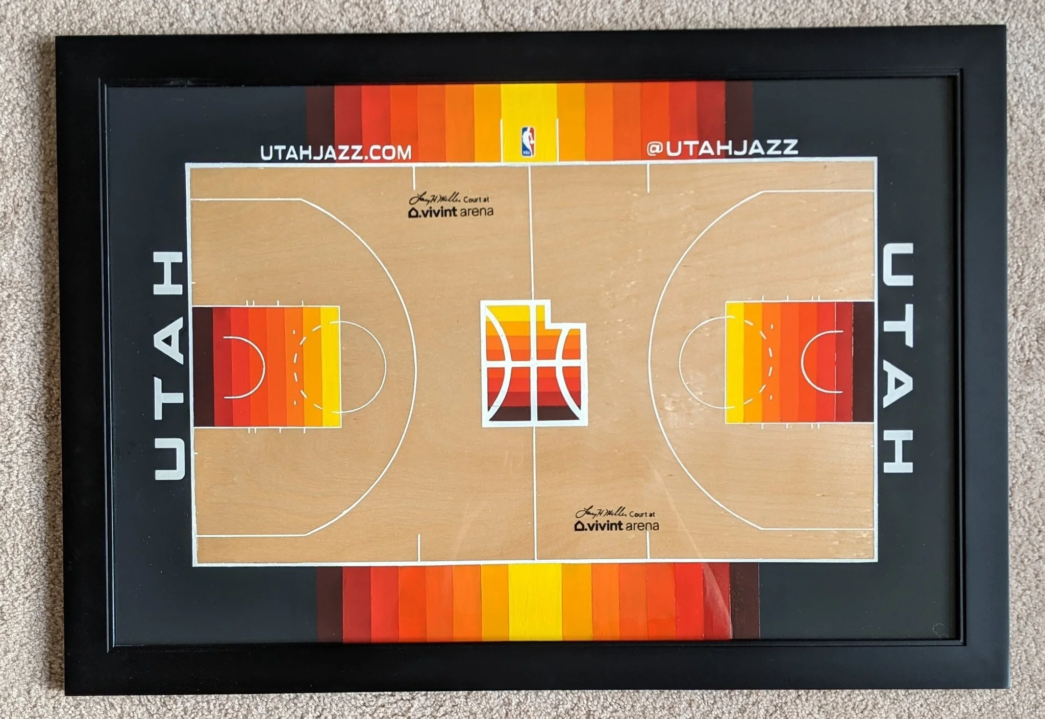
Combination logos
Each court has a team or theme and these examples below show how the logo fuses with team identity.

Design with Grimes project episode
What a project! Check out the Short Courts Twitter and Instagram.
Your next project
Let’s collaborate on your next project. Where it’s branding identity, social graphics, or a simple logo. Not sold? Check out my other projects below for inspiration.