New Orleans Saints
This project started as a primary logo competition through Super Design Bowl and I had a blast extending beyond that.
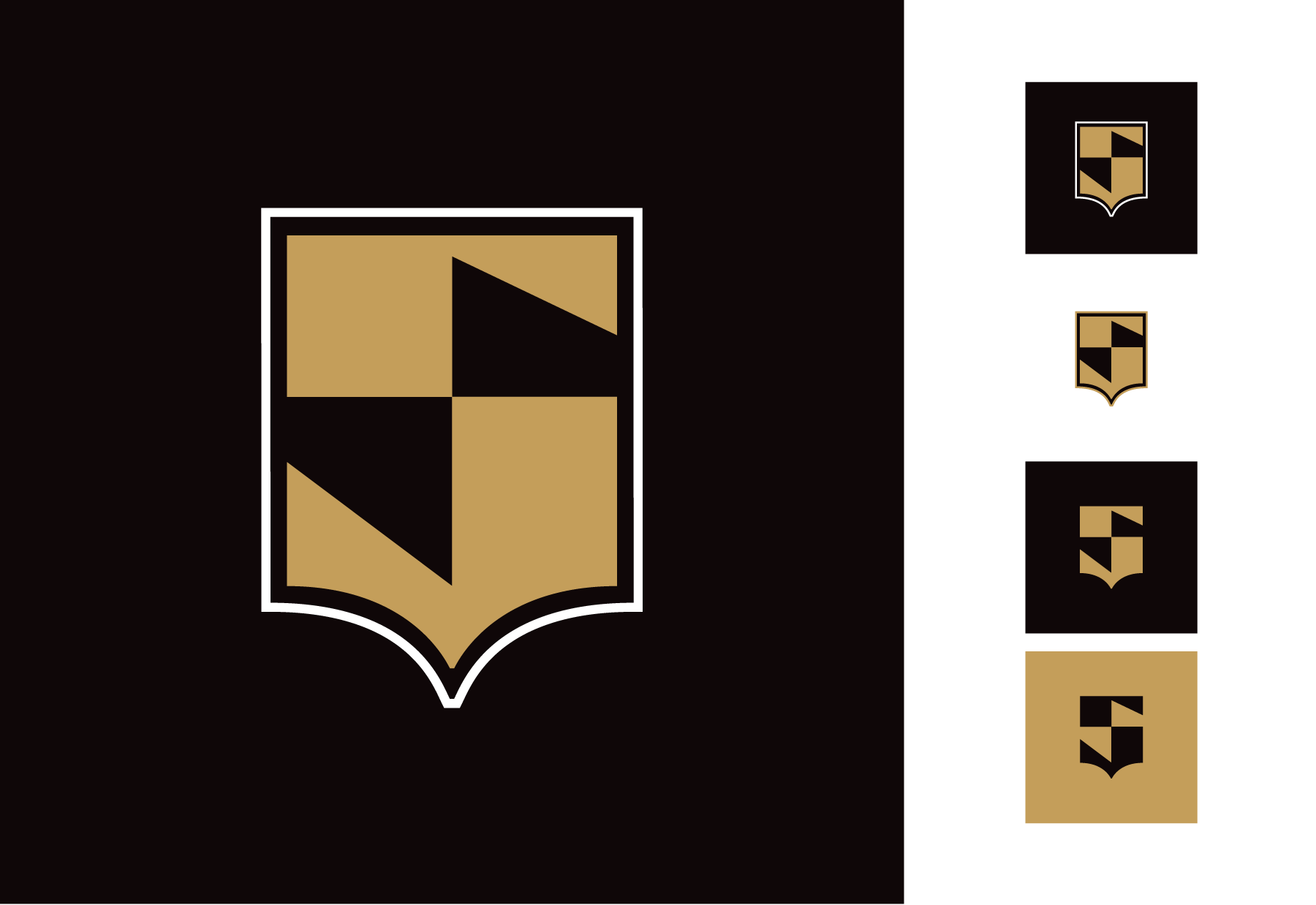
A simple mark transforms into a whole new identity.
Before we get into the transformation, let’s see how it all started…
Sketches & Inspiration
My inspiration came from reviewing the Saints logo history, and the shield graphic stuck out. The team was named "Saints" due to its birthday on the Roman Catholic Church's All Saints Day. Since joining the league in 1967 the team has remained fairly consistent with its logos and colors.
The shield stuck for a couple reasons: one it was part of the logo history, and two Saints are commonly memorialized on necklaces in a shield shape. After getting enough sketch work in, I got to the computer and started to bring it to life.
Primary Logo
Color for this rebrand remained untouched.
Custom logotype & secondary type
Part of the branding came from this custom high contrast logotype for '“SAINTS”. The “S” primary logo was modified and the remaining letters followed suit.
This rebrand also needed some legible secondary fonts to go on other materials, so Verlag and Blair were tapped to be in the system as well.
Alternate Logos
The shield motif flexes into alternate logos.


